Redesigning a reward system that feels simple to users while staying powerful behind the scenes.
Bravo is a QR-based payments and dining rewards app operating across a network of restaurant partners in Metro Vancouver. Its rewards had grown into four overlapping mechanisms, making the value difficult for customers to understand and increasingly complex for the team to operate. I led the redesign to simplify what customers see at payment while preserving the campaign flexibility the business needed — ultimately consolidating the experience around $1 cashback = $1 toward a future meal.
The Problem
Every payment turned into a math problem.
Our field team regularly promoted Bravo in person at partner locations around Richmond, where they kept running into the same problem: explaining how someone actually saved money with Bravo took too long.
After our CEO experienced this firsthand, I took a booth shift myself to find out where the explanation was breaking down. I didn't understand how bad it was until I had to sell Bravo myself.
People understood the basic idea quickly — pay with Bravo at participating restaurants and save money. The conversation became difficult when they asked one simple question:
“So how much do I actually save?”
Try answering that question using the old reward system.
The scenario
- 1The bill arrives
- 2Check your wallet
- 3Top up your balance
- 4Apply your rewards
- 5Payment complete
This is not the end UI, only for demo

PiDGin
350 Carrall St, Vancouver

4 ways to save, each with different rules
1,240 points
$12.40 available to redeem
$15 off $100
Only if the payable bill stays ≥ $100
4 bonus tiers
More value when adding funds
5% back
Earned after every payment
Each reward made sense on its own. The problem emerged when customers had to understand how they interacted.
- Top up $100+ $5 bonus balance
- Pay a $100 bill− $15 coupon today
- $85 charged× 5% cashback
- Cashback earned+ $4.25 for later
At the booth, explaining a single $100 payment could require walking through a top-up bonus, an eligible coupon, the remaining balance, a cashback rate, and how that cashback could be used later.
I wasn't the only one running into this. Our 20+ field staff consistently had the same issue: it took too long to explain how the rewards worked and how much someone would actually save.
And without someone there to explain it, the same confusion showed up in customer support. Users regularly reached out to ask how their savings worked or why a reward hadn’t applied.
The reward model itself had become too difficult to explain.
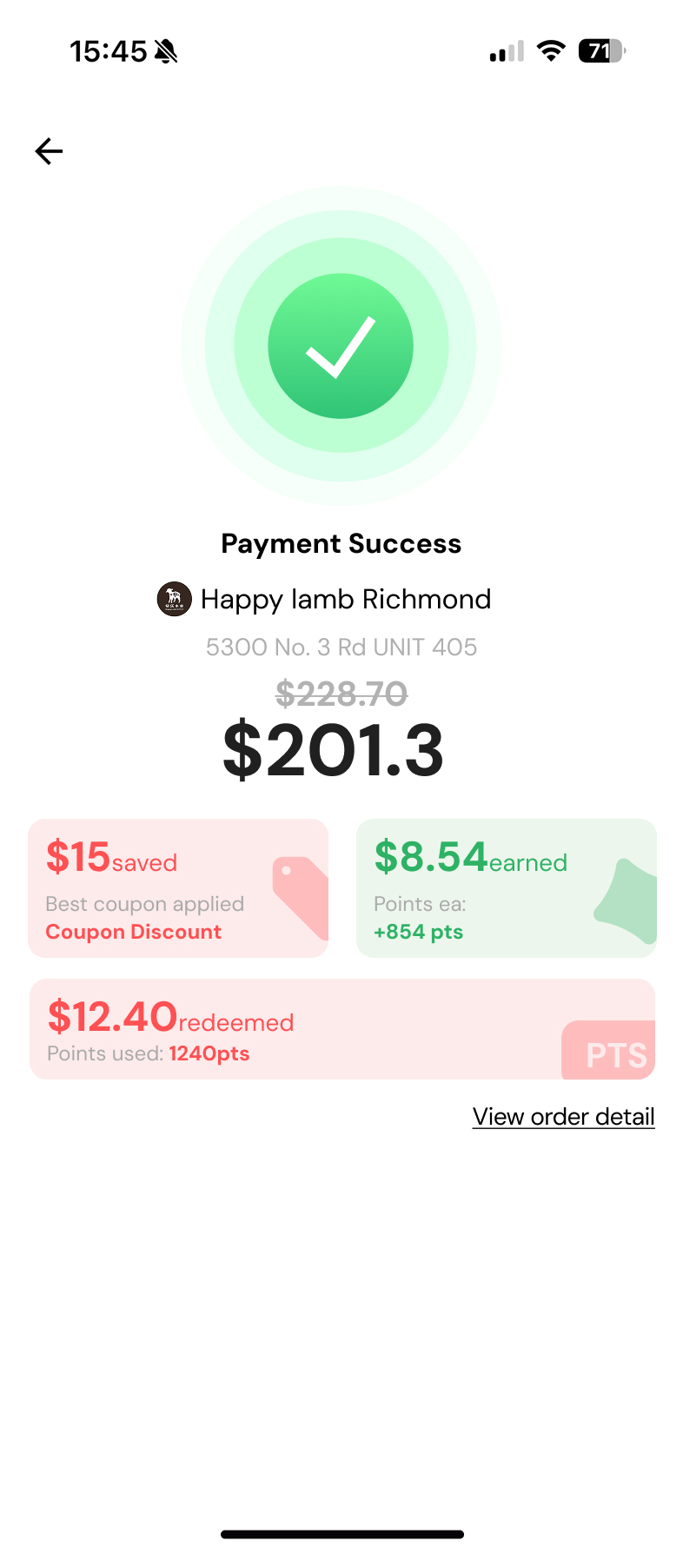
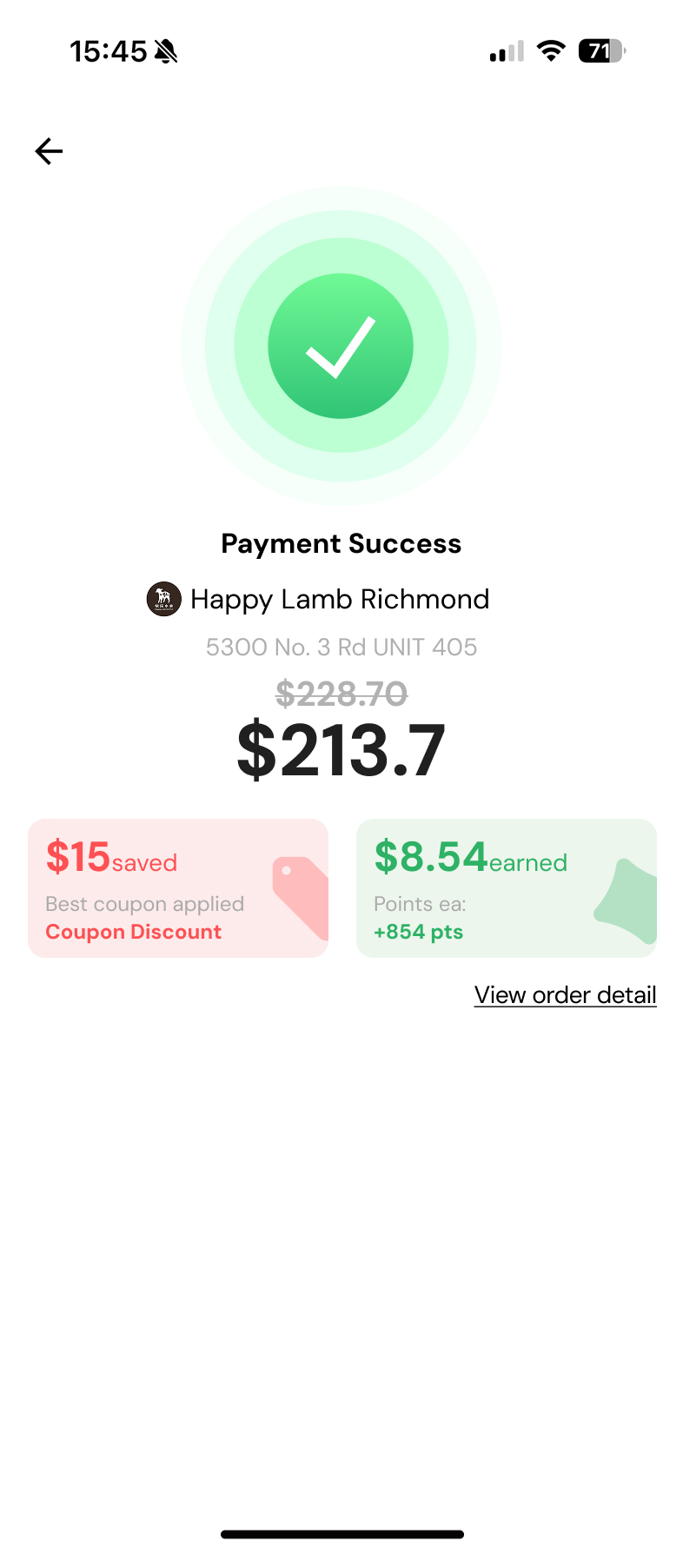
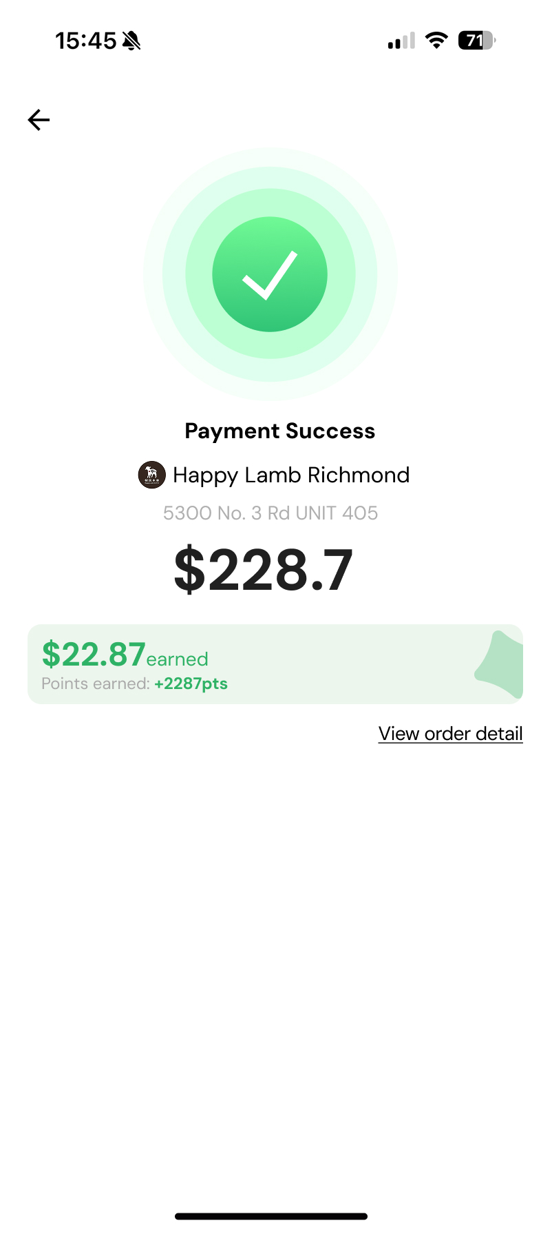
The same complexity was creating work behind the scenes.
The reward rules had to be configured, changed, timed, and reconciled across marketing, engineering, operations, and finance.
At the booth, we could explain the rules in person. In the app, users had to make sense of the same system on their own.
The incentive system wasn't badly designed. It was never designed as a system at all.
Each reward had been introduced for a different reason. Points encouraged repeat visits. Threshold coupons helped bring customers into selected restaurants. Top-up bonuses encouraged users to keep money in Bravo. Over time, these mechanisms started overlapping in the same payment and campaign flows — but they were still being managed as separate programs.
Behind the scenes, the same complexity created different problems for each team.
Marketing
Campaign changes meant manual reconfiguration. Special campaigns required identifying eligible restaurants, overriding existing coupon rules, then restoring them when the campaign ended.
Engineering & Operations
Time-sensitive campaigns depended on manual coordination. Backend reward rules and customer-facing campaign content had to be turned on and off separately.
Finance
More reward types meant more reconciliation paths. Points earned, bonuses issued, coupons deducted, and rewards redeemed created separate earning, deduction, and redemption records to reconcile.
The Challenge
Two sides. One system. Both had to win.
Simplifying the rewards wasn’t as simple as removing the rules. Bravo had different commercial agreements across its restaurant network, so campaigns needed to support different rates, thresholds, time windows, and eligibility conditions.
The business needed that flexibility. Customers didn’t need to manage it at checkout.
- Predictable savings
- Simple checkout
- Clear reward value
- Different cashback rates
- Spend thresholds
- Time windows
- Visit requirements
- Campaign eligibility
The Decision
Did the value justify the complexity?
We used one question to evaluate each reward mechanism: did its value justify the complexity it added to the payment experience? That led to three different decisions. We removed the mechanism whose promotional value no longer justified the complexity it introduced, preserved the mechanism customers were actively responding to, and simplified how stored reward value was understood.
Remove threshold coupons
Easy to understand. Hard to guarantee.
$15 off $100 gave customers immediate, concrete value. But eligibility depended on the restaurant, campaign, spend threshold, and commercial agreement.
The instant value wasn’t worth the unpredictable eligibility and operational complexity.
Keep top-up bonus
Oct 3–6 elevated-bonus campaign vs. Sep 24–Oct 2 active baseline · PostHog
Preserve the incentive. Remove its complexity from checkout.
Convert points → dollar cashback
Preserve stored reward value, remove the conversion math.
Users holding $30+ in unspent cashback returned about twice as often as everyone else.
*This was correlational, not proof that cashback caused the higher return rate. But it was enough directional evidence to avoid removing stored rewards while simplifying the system.
Three decisions, one principle: remove complexity unless we had a reason to preserve it. Threshold coupons offered clear value, but their unpredictable eligibility created checkout and operational complexity. Stored rewards showed a strong relationship with repeat behavior, so we preserved the value but removed the points conversion. Top-up bonuses stayed because the elevated-bonus period showed much larger top-ups and broader participation, while the decision to top up happened before checkout.
First purchase
Up to $10 back
Every $320 spent
Up to $20 back
$105.56/$320
Every 3 purchases
Up to $15 back
$6.5 pending
Every 3 purchases
Up to $30 back
$121.5 pending
Every purchase
Up to $10 back
The System in Practice
Change the rules. Keep the experience consistent.
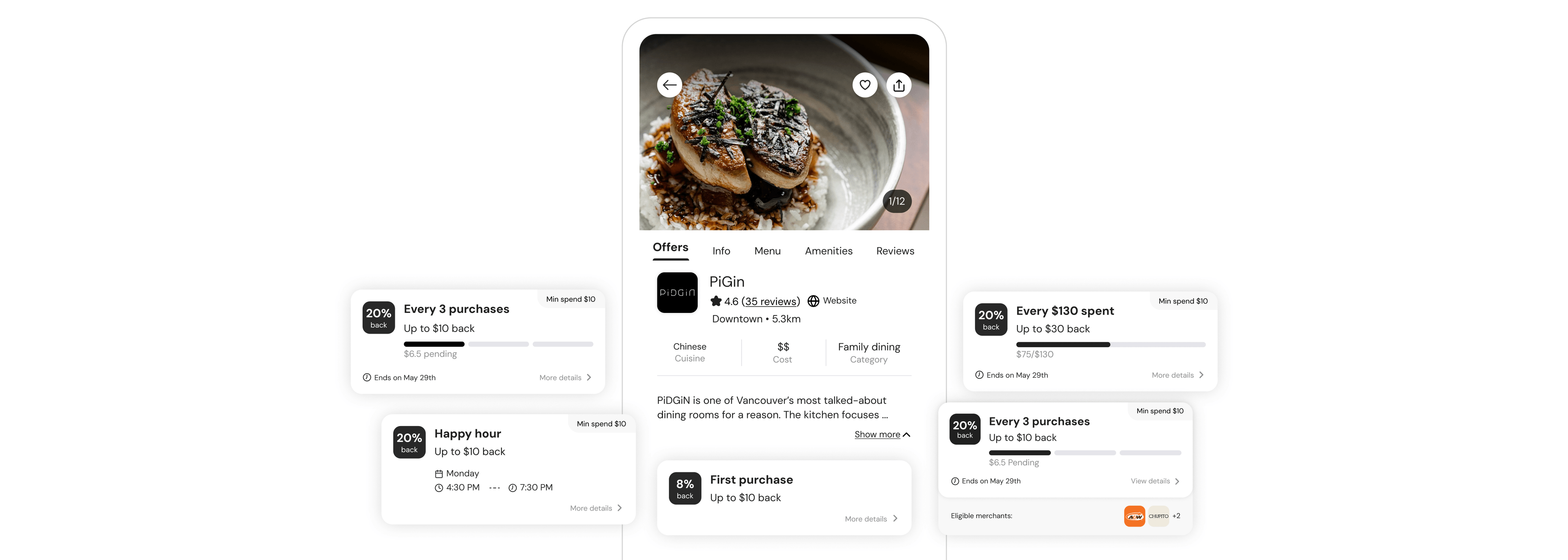
I broke the old campaigns into a small set of reusable rules — reward type, rate, eligibility, threshold, and time window — then designed one offer model that could combine them while keeping the customer-facing experience consistent.
Adjust the campaign rules and watch the customer-facing offer update.
Set Cashback
Set threshold
Set dates
Set active hours
Set additional requirements
Admin interface shown for illustration — not final UI
PiDGin
Downtown · 5.3km
Chinese
Cuisine
$$
Cost
Family dining
Category
PIDGIN is one of Vancouver's most talked-about dining rooms for a reason. The kitchen focuses …
Happy hour
All in-store purchase
Info
I designed a small set of cashback formats, spend, visit, time, and first-purchase-based—that could be combined behind one consistent offer card. Marketing could change the rules without redesigning the customer experience.
Different rules underneath. Same language for customers.
The Outcome
The system no longer needed as much explaining.
Earlier, “So how much do I actually save?” meant explaining points, coupons, thresholds, top-up bonuses, and how they worked together.
The new system kept the campaign flexibility, but gave customers one reward to understand. They might earn cashback from a first purchase, a spending milestone, repeat visits, or a happy hour promotion — but the value stayed consistent: $1 cashback = $1.
After launch, customer support reported that questions and calls about how savings worked became rare. Marketing also found the model easier to set up and explain across different campaigns.